Why Matte Finish Booklets Are a Smart Choice for Professional Printing
When I started working with print more than a decade ago, I thought glossy was always the way to go. Shiny catches the eye, right? But over time, I learned that the finish you choose says as much about your brand as the content inside. Matte finish booklets have become a go-to for clients who want something that feels substantial, sophisticated, and easy to read. They work especially well for corporate reports, training manuals, and portfolios where the reader needs to focus on the information, not the glare.
One of the first things you notice with a matte finish is how it handles light. There is no reflection bouncing off the page. That makes a real difference when someone is reading under a desk lamp or in a bright office. I have had clients in Lancaster ask me why their last print run felt cheap, and nine times out of ten the issue was a finish that fought against the lighting. Switching to a matte finish booklet fixed that problem instantly.
The Feel of Quality
Touch is a sense we often overlook in print, but it matters. A matte finish booklet with a laminated cover has a smooth, almost velvety texture that invites handling. If you add a soft-touch coating, the effect is even more pronounced. People pick it up and they do not want to put it down. That is the reaction you want from a prospect flipping through your catalog or an investor reviewing your annual report.
I remember printing a run of business cards for a design studio that insisted on a matte finish with a soft-touch coating. They handed them out at a conference and got comments all day about how "nice" the cards felt. That same principle applies to booklets. When you choose matte finish booklets, you are signaling that you care about the details. It is a small choice that carries a lot of weight.
Clarity and Readability
One practical advantage of matte is how it handles ink. Glossy coatings can make text look a little fuzzy if the lighting is not ideal. Matte paper absorbs light instead of reflecting it, so text stays crisp and easy to read. That is crucial for booklets that contain dense information, like training materials or technical guides.

Color reproduction also benefits from a matte surface. When you work in CMYK and send a file to an offset printing press like a Heidelberg, the matte stock holds the ink without letting it pool or spread. Pantone colors come through accurately, which is important for maintaining corporate identity across multiple pieces. I have run side-by-side comparisons where the same design on glossy and matte paper looked completely different. The matte version was more subdued but more faithful to the original proof.
Production Choices That Matter
Not all matte finish booklets are created equal. The paper stock changes everything. A 100 lb gloss text might seem like an odd choice for a matte finish, but it actually works well when you want a sturdy page with a smooth surface. The key is to pair the right stock with the right binding and trim size.
For short-run projects, digital printing is efficient and cost-effective. You can produce a few dozen booklets without the setup costs of a full offset run. But if you need hundreds or thousands, offset printing on a Heidelberg press gives you better consistency and lower per-unit costs. I always advise clients to think about quantity before choosing a method. A run of fifty matte finish booklets with saddle stitching makes sense for a small event. A run of five hundred with perfect binding is better for a sales catalog you plan to mail out.
Bleed is another detail that separates amateur work from professional results. If your design goes all the way to the edge of the page, you need at least an eighth of an inch of bleed on each side. Without it, you risk a white line along the edge after trimming. That is especially noticeable on a matte finish because the coating does not hide imperfections the way gloss can.
Proofing Before Production
Proofing is non-negotiable in my book. A digital proof gives you a good idea of color and layout, but a press proof is better if you are matching a specific Pantone color. I have seen too many projects go wrong because someone approved a proof on a glossy screen and then the printed matte finish booklet looked completely different. The paper absorbs ink differently, and the finish affects how light interacts with the color. Always ask for a physical proof on the actual stock you plan to use.
I once worked with a Lancaster nonprofit that was printing their annual report. They wanted a matte finish booklet with a laminated cover and perfect binding. The digital proof looked great, but when the press proof came back, the corporate blue was too dark. We adjusted the CMYK values and reprinted the proof. That extra step saved them from a costly rerun. Proofing is cheap insurance.
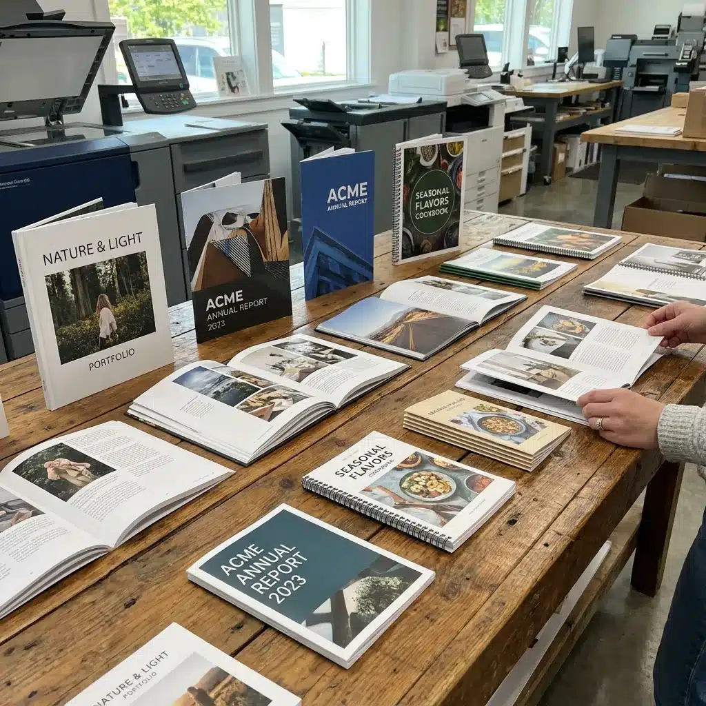
When Matte Makes Sense
Matte finish booklets are not the right choice for every project. If you are printing a brochure with lots of product photography that needs to pop, glossy might serve you better. Glossy finishes enhance contrast and saturation, which makes images look vivid. But if your booklet is heavy on text, charts, or illustrations, matte is usually the better option.
Here is a quick breakdown of when I recommend matte:
- Annual reports and corporate identity pieces that need a professional, understated look
- Training manuals and guides where reading comfort is a priority
- Portfolios for artists, designers, or photographers who want the work to speak for itself
- Catalogs for high-end products where the feel of the paper reinforces the brand
And when I lean toward gloss:
- Brochures for retail or travel that rely on vibrant imagery
- Business cards for industries where flashy is part of the brand
- Short-run promotional pieces that need to grab attention from a distance
Every project has its own set of requirements. The best printers in Lancaster will walk you through the trade-offs. They know how paper, ink, and finish work together to create a piece that meets your goals.
Practical Tips for Your Next Project
If you are planning to order matte finish booklets, here are a few things to keep in mind. First, talk to your printer about trim size early. Standard sizes like 8.5 x 11 inches are economical because they waste less paper. Custom sizes look great but cost more. Second, decide on binding before you finalize the page count. Saddle stitching works for booklets under 64 pages. Perfect binding is better for thicker books. Third, check your file setup. Make sure you have proper bleed, that your images are at least 300 dpi, and that your color mode is CMYK. RGB files will not print correctly, especially on a matte stock.
I also recommend asking about recycled paper options. Many printers now offer matte stocks made from post-consumer waste that still take a laminated cover and print beautifully. It is a small change that can reduce the environmental impact of your project without sacrificing quality.

Why Local Printers Still Matter
Working with a local printer in Lancaster has advantages that online print shops cannot match. You can visit the facility, feel the paper samples in person, and talk directly with the person who will run your job on the press. That kind of collaboration often leads to better results. I have seen it happen many times. A client walks in with a vague idea, and after ten minutes of conversation, they leave with a clear plan and a better product.
Local printers also tend to be more flexible with short runs and tight deadlines. If you need fifty matte finish booklets for a conference next week, they can make it happen. Online services usually require a longer lead time and offer less room for customization. That personal touch is worth a lot when the details matter.
Matte finish booklets are not a trend. They are a classic choice that works across industries and applications. The next time you need a booklet that feels refined and reads well, consider going with a matte finish. Your readers will notice the difference, even if they cannot quite put their finger on why.